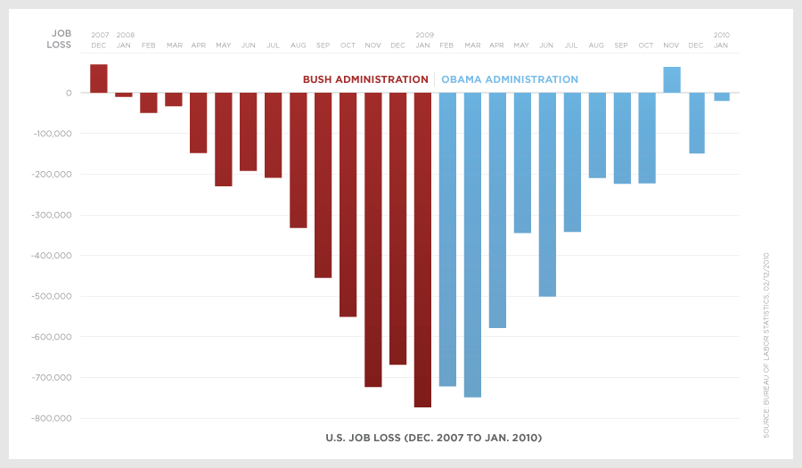
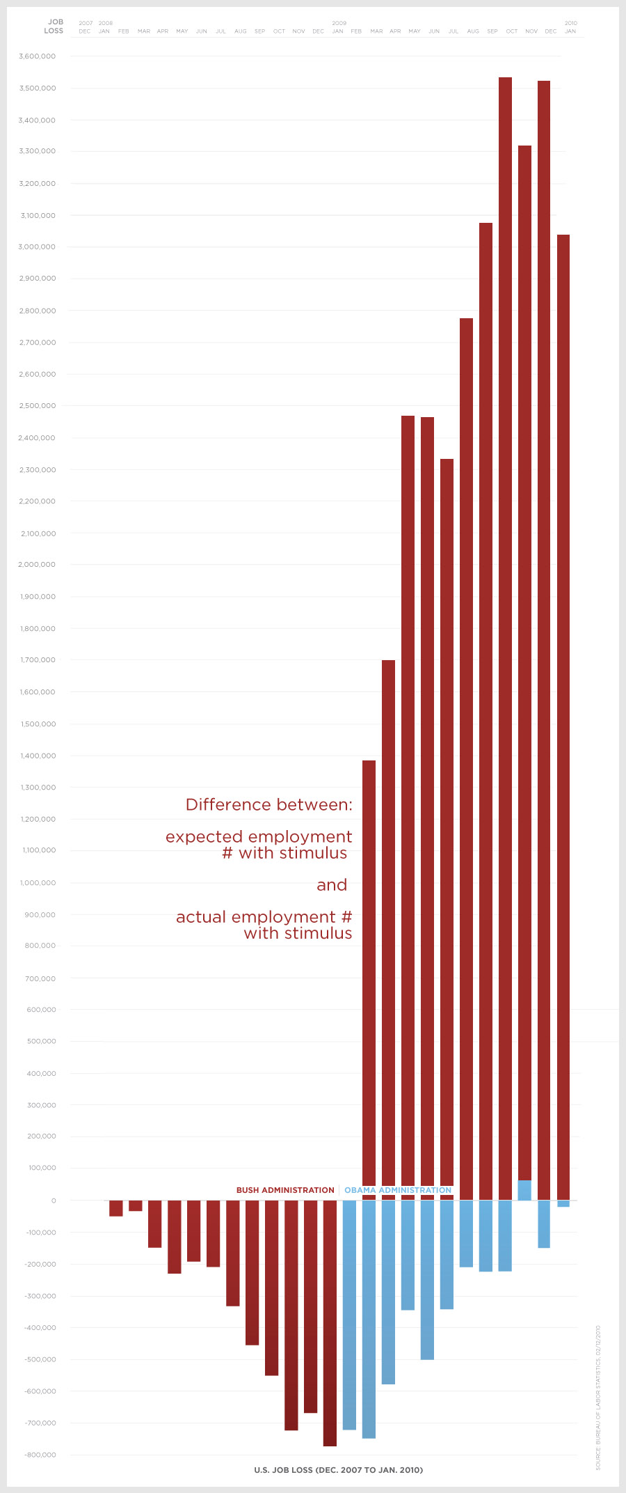
The top graph is the number of newly unemployed people each month. The bottom graph adds what the numbers should be based on stimulus promises. It is hard to fathom how people could still think that the stimulus work not even talking into account the
failed unemployment rate promises.
Pictures embedded below.
Head to the source for the base numbers.


No comments:
Post a Comment